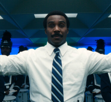
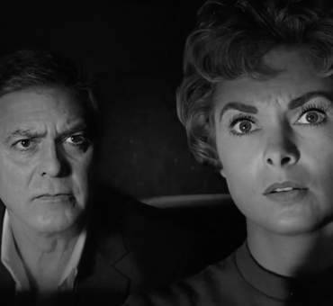
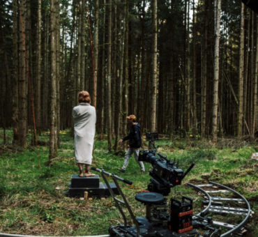
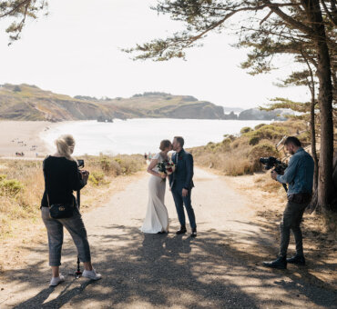
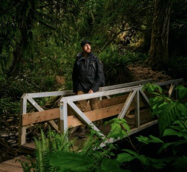
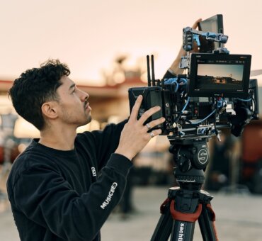
We talk a lot about finding your voice, but we don‘t always talk about the consequences of doing so. Namely, once you’ve found your voice, people have to make a decision about whether or not they like it. For Director Niclas Larsson, he’s won and lost jobs based on pushing his style:
“I tend to push a little too hard, perhaps. Then again, I don’t want to apologize for pushing what I believe in. At the end of the day I’m aware that I speak a different language than some clients do, but I think it’s exciting to push the boundaries.” Niclas told us.
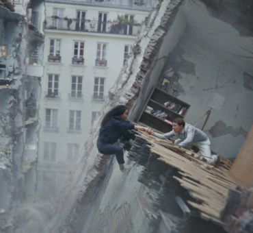
The difficulty of being creative is that agencies, brands, or production companies can’t live in your brain. But, when you find the right partner, it can be beautiful, and Niclas’ portfolio is a prime example. He’s behind Vogue’s Magic Diner Part 1 and Part 2, spots for Mercedes, Apple Music, and Volvo’s award-winning spot called The Parents.
In our conversation, we talked about how he created the Volvo spot and the greater implications behind his directorial decisions. Each of these decisions is a glimpse into his vision, one that he’s honing on each new project.
Here’s Director Niclas Larsson.
Musicbed: Does your knowledge of acting affect your approach as a director?
Niclas Larsson:
I certainly hope so! Although I haven’t acted professionally in over a decade, I still feel a certain confidence when I work with people like Alica or Fares Fares. They are truly two of the best actors coming out of Sweden right now. Even when working with that kind of talent, I have this basic knowledge of their craft that I wouldn’t have had if I didn’t spend so much time acting growing up. I like to push my actors as that’s something I responded to when I acted. A kind of actor’s confidence, I suppose?
Over the last 10 years I’ve focused on fine-tuning my visual style, though. How does a Niclas Larsson project look? I’m slowly getting to where I think it looks good, but it’s a process. It’s a living thing, right?
I’m in a position now where I’m very lucky because clients seek me out for my style. I’ve done a lot through Volvo and my first film with them, five years ago, was very dark and very sort of Scandinavian “Scandi-Noir.” But, as I evolve as a director, I’ve had different conversations. I’m always trying to find ways for brands like Volvo to evolve, as well. It’s a collaborative effort of course, but Volvo has really shown trust and confidence in what new ideas I bring to the table.
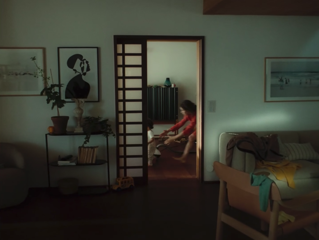
That’s what makes commercial work interesting: creative forces meet corporate needs. For example, with The Parents, Linus (Sandgren) and I discussed a lot about how to make it feel like this light comedy in the first section of the film, and how to turn it into something darker while keeping the interest of the story. We were talking about those two yin and yang worlds. Comedy versus tragedy, you know?
The spot walks that line so well.
Thank you! For the past three years or so, I was in the darker spectrum of commercials. Companies called me and asked for these dark, emotional pieces. Lately, I’ve been pushing an idea on many jobs that I’ve lost, where I’m like, “What if we combine humor and darkness? What if it’s a comedy and a tragedy?” It’s like the old Greek theater masks, the sad face and the happy face. How can you make that into one ad? I think we proved it was possible in The Parents. It did work! I honestly believe that’s why people like it.
Do you primarily find that balance in the edit?
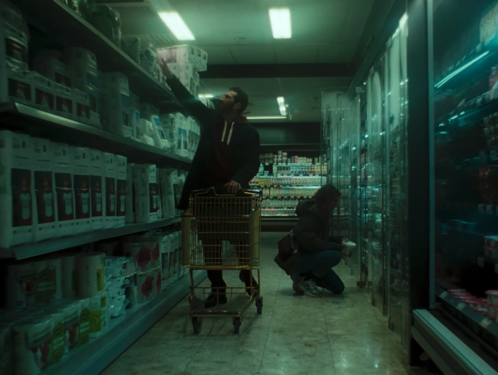
It’s tricky. I knew exactly what the problem was going to be in the edit and I even told Carla (Luffe, the editor). “There’s this one switch, and I want to speed ramp the film.” So we actually ended up hand-cranking the film. But, how do we go from this one feeling, to this speed ramp crank thing? I couldn’t find the solution in the script. I knew that was ultimately going to be the challenge in the edit.
On my eighth or ninth day of the shoot, I’m starting to have severe panic. How do we switch this tone from one side to another? I just shot it and shot as much as I could. In the edit, Carla came up with this idea to just cross-cut the music. What if the music starts messing up first, then the image follows? That was a genius move because it lures the audience into thinking something is wrong. You allow the image to follow by just cracking up the image. It was all Carla’s idea to do that. Sound, followed by image.
Are you using references to generate these ideas?
I try not to. Usually, I write the script first based on what is in my head. After I’m done writing, I’ll look at references or directors I follow or old movies and all that stuff. But of course, it’s impossible not to be inspired and influenced by others. I try not to look at commercials, I tend to lean into watching old movies and stuff.
The crank thing came from Eternal Sunshine, and a lot of bad action movies, but me and Linus had to do pretty advanced tests before the shoot to see if it actually could be done nicely.
It was really hard. I called Linus and asked “How do we show this technique to the client?” He said, “We have to shoot it. I don’t think it’s been done in the way you’re thinking.” In The Eternal Sunshine of the Spotless Mind it was very flashy and metaphorical and I didn’t want it to be that. That could scare the agency and client. So, we rented a camera and just cranked some rolls to show the agency.
Did you and Linus come up with a visual language for this piece?
Linus and I know each other really well. We’ve done a couple of ads together before and a short film for Mercedes two years prior to Volvo called In the Long Run. Whatever we did for that project made it look like a movie, and we wanted to take the same approach. But, how do we make it fun? Where is the fun part? Let’s not make it dramatic.
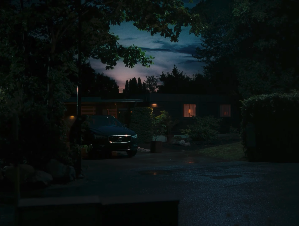
First of all, we shot everything on film. So that was given. But then Linus told me, “Why don’t we shoot it in 4:3, and then you can just decide in the edit where to refine.” Having a 4:3 format on this worked really well. And that was something in the edit we discovered. But for the American client, they didn’t like the 4:3 format. We ended up doing a 16:9 format for television. Then they later released the long version of the 4:3 format. Funny enough, the 4:3 version is the only one that wins awards. In retrospect, we all liked it better.
Why do you think 4:3 works so well here?
It doesn’t look like the classic car ads. So the expectations are set from the beginning—whatever you think this is, it’s not going to be that. And then, portrait wise I have a lot of these close-ups where we just threw on a 25mm lens and had our actress go really close to the camera, and that works really well in the comedy sense. It became less “addy” and more film-like. I think that’s why people react to it so well.
Maybe some of it’s about nostalgia, too. I don’t know if so many people refer to the 4:3 films the way cinephiles like you and me or Linus do, but kids seem to really like it. It’s definitely cool now. We never do stuff because it’s cool, though. That’s never an approach. A lot of the conversations Linus and I have are about if something looks too good. I mean, I’m working with one of the best DPs in the world, and sometimes he thinks it looks too good. But that’s not always the best way for the story. The 4:3 just has that balance I think.
What are the dangers of something looking too good?
I think it creates a distance between the audience and the story. All of these cool sports ads or even beer ads now have a vintage anamorphic lens and shoot all these really cool people in all of these cool settings to disguise a very flawed story or limited story. If you have a cool style that distracts the audience from the story, what are you hiding?
But you know, it’s hard to make honest cinema. That’s something me and Linus and Carla talk about all the time. What’s the truth here? How do we make that look good, and not hide behind a cool shot?
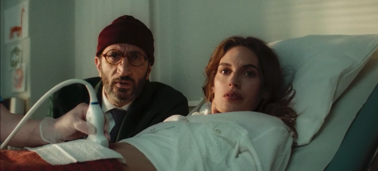
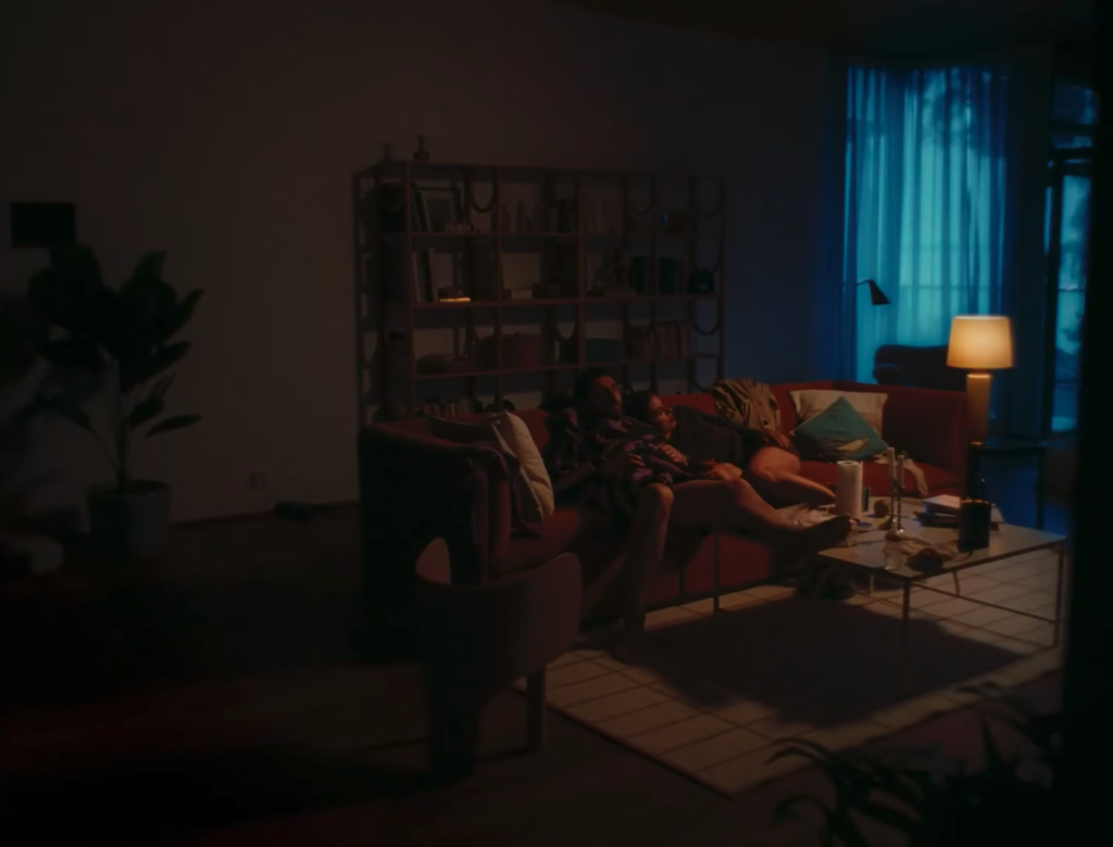
Take Volvo, for example. Right after the screen showing they’re having twins, I cut a reverse to a two-shot of the parents. I just wanted this clean two-shot of the parents, saying “This is the story.” There are many ways to do that and I told Linus, “I don’t want it to look like a commercial. I want it to look like a movie where this couple is going to play the lead role in this comedy.”
We broke it down — white walls, front-lit, etc. We wanted it to look like a comedy from the 90’s. There’s not a cool window in the background, no shadow. It’s straight on. It might not seem like a very complicated shot, but in reality I think we did well over 50 takes. It’s one of the hardest shots I’ve ever done. That’s what I mean by “honesty”. It’s not a stereotypical “cool” shot, but it’s honest and serves the story.
Movies I like, David O. Russell and Paul Thomas Anderson and all these sorts of purists, they never hide behind a cool shot. They actually show the story rather than hiding it behind the visual. But, it still looks good.
What was Volvo’s reaction to techniques generally not used in ads?
Honestly, they trusted me and I’m thankful for that.
At the end of the day, I know I’m speaking a different language but I’m speaking with experience and I’m lucky to have trusted talent alongside me like Linus and the actors. They’re some of the best in Scandinavia and maybe in the world. I may tend to push hard for a product or different visual style but it’s just about going to the agencies and the clients and saying “Let’s create a new tone and see what we can do with it.”
If a client wants something that’s very specific or they want to maintain an existing style, they probably shouldn’t call me. But if they want to push the boundaries, they can always give me a call.
Read more about developing a visual language and having an uncompromising vision with commercial director Ian Pons Jewell.
